
Haddonfield Fitness already had a solid website. I know, because I upgraded it years ago and have maintained it ever since.
But website technology has changed dramatically in just the past year, and it's never been easier to turn an already-good site into an incredible online experience. So when I was showing the Haddonfield Fitness team all the new ways to upgrade a website, they jumped at the opportunity.
That was a wise decision on their part. Fitness is an intensely competitive industry, and my small business marketing framework says that when you have a lot of competition, you need to keep leveling up to avoid falling behind.
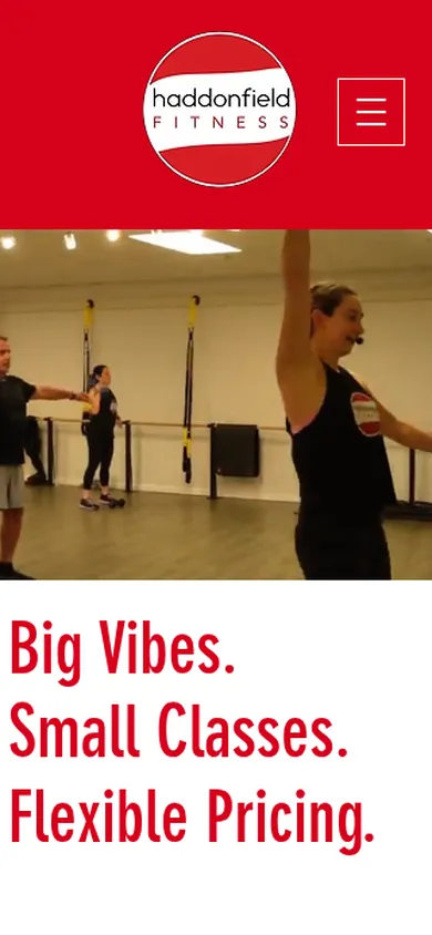
So, in only a couple of days, I completely rebuilt the Haddonfield Fitness site. I moved it off Wix, a platform that had started to feel clunky, and rebuilt it entirely in custom code, for a lightning-fast, ultra-premium site that reflects the quality of the classes and training at Haddonfield Fitness.
Here's what changed: a more premium design, a much faster site, and a site that's easier to keep up to date.
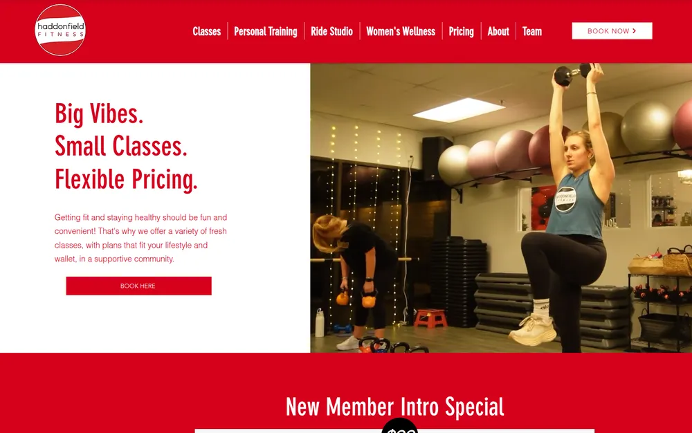
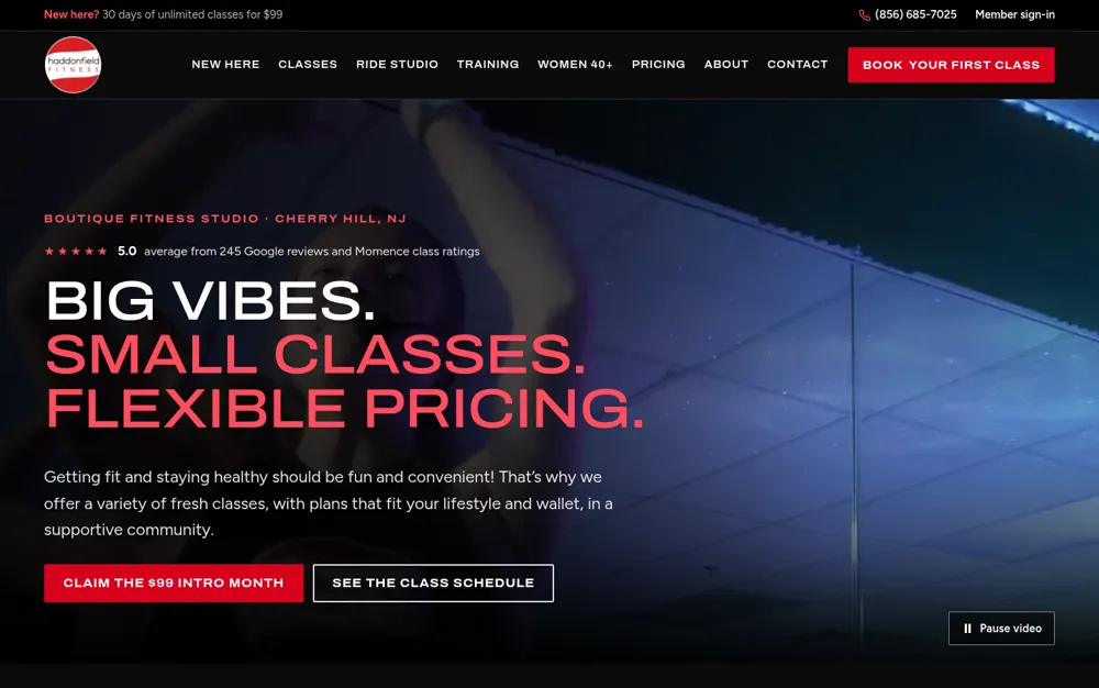
Big vibes, small classes
Haddonfield Fitness has been training people since 2013, now from 219 Haddonfield-Berlin Road in Cherry Hill. Classes run seven days a week: Ride, strength, barre, core and small-group training, plus personal training, InBody body composition scans and Balance Blueprint, a program for women in midlife and menopause.
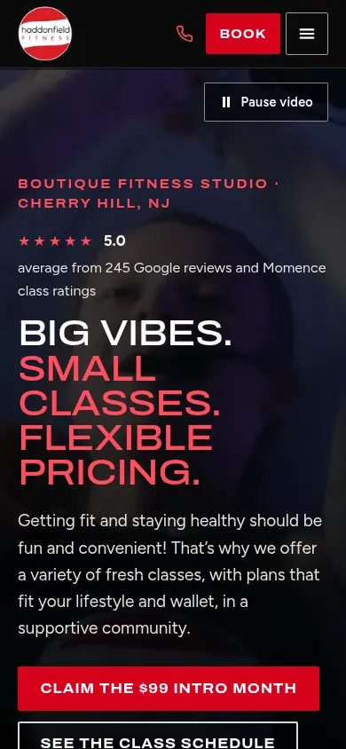
This isn't a strip-mall gym. It's a boutique studio with a lights-down Ride Studio, small classes and a 5.0 rating from 245 Google reviews and Momence class ratings. The website should feel like the studio does when you walk in.
Booking runs through Momence, so the website has one main job: get a new person from "this place looks fun" to a booked first class, and get regulars to the schedule fast.
A premium design that feels like the studio
The new haddonfield-fitness.com is dark, like the Ride Studio with the lights down, with a promo video behind the headline and big, confident type. A slim bar across the top of every page carries the $99 intro offer, the phone number and member sign-in, and the Book your first class button stays in the header on every page.
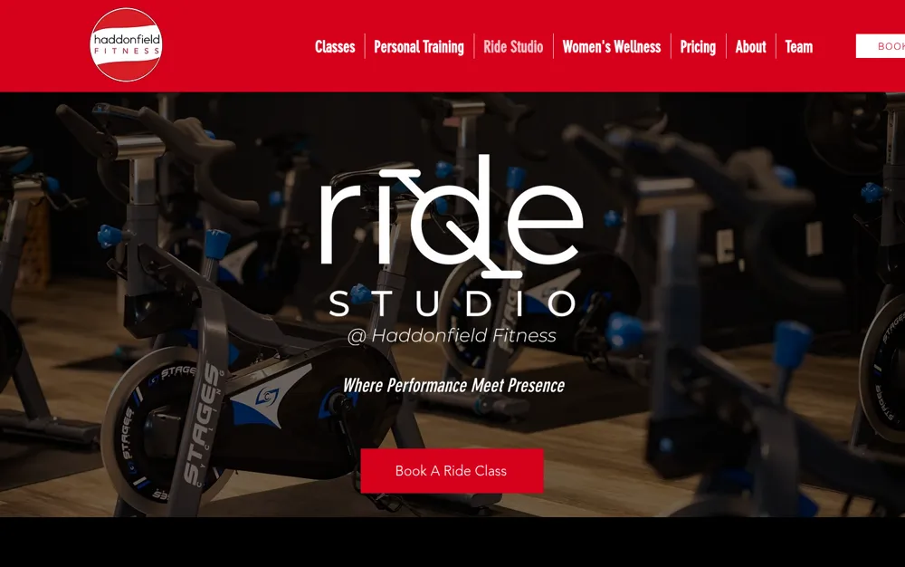
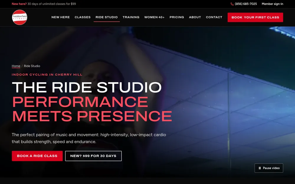
A few other things the new site does:
- A New Here page that walks first-timers through picking an intro offer, booking a class and what to bring.
- One Pricing page with every class pack, membership and personal training bundle, matched to Momence.
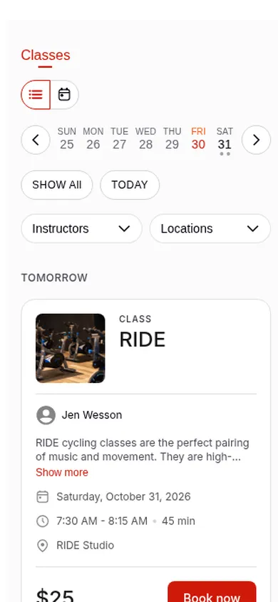
- The schedule on the Ride Studio page shows Ride classes only, so riders don't have to wade through barre.
- Bios and photos for all 17 instructors and trainers.
- Real reviews from Momence, quoted word for word and labeled as class ratings, alongside the Google rating.
Why custom code made it easier
Wix is great for getting a business online and keeping it there. Its drag-and-drop editor is what makes it feel easy: every element sits at a spot you place by hand.
The catch comes when you want a design like this one. Every effect has to be placed, checked and nudged on each screen size. Phones get their own separate layout, so anything you add on desktop has to be arranged again for mobile. And anything Wix doesn't do natively, like the Momence schedule, goes in an embed box with a height you set by hand.
With custom code, the design is built once and adapts to whatever screen it's on. That freed up the time to go further: a header that fits every screen, video heroes, and pages built around the visitor's next step, on a laptop and a phone alike.
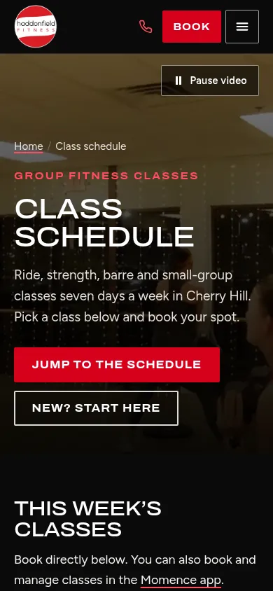
The class schedule, the second most visited page on the site, got the same treatment. It now opens with a heading, a short description and buttons to jump to the schedule or get started as a new member.
Lighter, faster and easier for Google to read
Here's the part you can't see in a screenshot. To show one page, a Wix site loads Wix itself: the code behind its features and apps, plus Wix's own tracking. The old homepage downloaded 182 files, including 1.3 MB of JavaScript, before a phone could fully use it.
The new homepage loads 16 files and about 2 KB of JavaScript. Most of what's left is the video.
On Google's Lighthouse test for phones, the old homepage scored 57 for performance. The new one scores 96. The Ride Studio and Team pages jumped from about 60 to the mid-90s, too.
Every page also has a clear title, description and heading, plus structured data that hands Google the studio's hours, location and answers to common questions. And because we kept the same web address for every page people actually visit, the move shouldn't cost the studio the search rankings it already earned.
Easier to keep up to date
A great website has to stay great. Behind the scenes, the studio's hours, address and phone number live in one file that feeds every page, the footer and the data Google reads. Change them once, and they're right everywhere.
The same goes for the design. A new section or a new page is built once and works on every screen size, with no separate mobile layout to rearrange. That makes updates quicker, and it means the site keeps its polish as the studio grows.
Technical details: before and after
| Measure (homepage, on a phone) | Wix site | New site |
|---|---|---|
| Lighthouse performance score | 57 | 96 |
| Time until the main content appears | 4.3 seconds | 2.7 seconds |
| Time the page is busy running scripts | 0.9 seconds | 0 seconds |
| Files downloaded | 182 | 16 |
| JavaScript | 1.3 MB | 2 KB |
| Total download | 4.8 MB | 0.7 MB, mostly the video |
| Lighthouse accessibility and SEO scores | 92 and 92 | 100 and 100 |
| Business details Google can read | Name and address | Hours, location and FAQs across the site |
Both sites were tested Oct. 30, 2026, with Google's Lighthouse in phone mode, three runs each. Analytics and ad tracking were switched off on both, so neither site gets credit or blame for them.
Is your good website ready to be great?
A website that works isn't the finish line, especially when your competitors keep upgrading theirs. With today's tools, a good site can become a great one in days, not months.
Think your site could look better and load faster? Book a free intro call, and we'll talk through what it would take to get there.

Lee Procida is the founder and president of Mountwell Marketing, and serves as the marketing lead for more than 30 small and medium-sized businesses. More about Lee
Want help putting this into practice?
Book a free intro call and we'll talk through what makes sense for your business.